 Eski Pano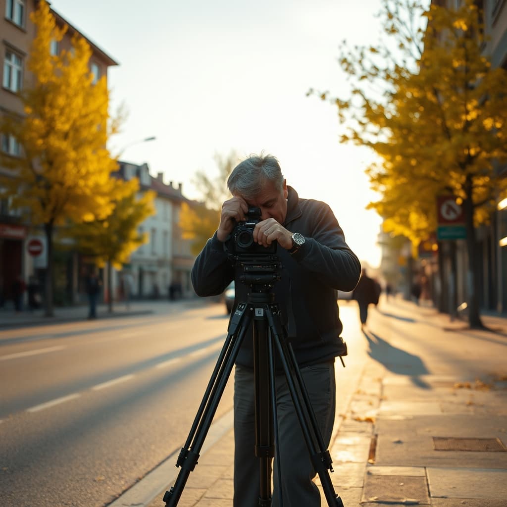
A yellow-leaf afternoon on an old city postcard can look more radiant than the street ever appeared on an ordinary day. The image may combine low seasonal light, a carefully chosen viewpoint, printing contrast, later colouring and the simple fact that an attractive frame was selected for circulation. Its brightness is real as a visual effect, but it is not proof that the past itself was happier, cleaner or more luminous.
City photographers worked with available light and with the expectations of publishers and buyers. A street that seemed flat at noon could gain long shadows and warmer surfaces later in the day. Autumn foliage supplied colour and a visible sense of season, while the photographer decided which hour, direction and exposure made the scene legible enough to become a postcard.
The Bright Afternoon Began as a Selection
A postcard view usually survived because someone chose it from alternatives. The successful frame may exclude a clouded sky, a congested corner or the less picturesque side of the street. Several exposures could produce different detail in trees, façades and people. Without negatives or a studio ledger, the archive should not claim to know how many attempts preceded the published image.
The season was selected too. Yellow leaves offered contrast against stone, timber, tram lines or dark clothing, but their presence does not date a card precisely. Climate, tree species, local conditions and printing choices affect colour. A written or printed date may refer to mailing or publication rather than the moment the shutter was released.
Printing Rebuilt the Light
The postcard was not the same object as the camera negative. Cropping could remove a dull edge; contrast could deepen shadows; paper surface could make highlights appear crisp. Monochrome images might be tinted or printed in coloured processes whose tones were interpretive rather than a measured record of the street. A luminous yellow canopy may therefore belong partly to the print workshop.
Different editions of the same view can reveal this work. Borders, captions, sky, foliage and density may change while the underlying photograph remains recognisable. Both sides should be scanned, and edition differences described rather than collapsed into one “original” appearance. The printer and publisher are part of the image history alongside the photographer.
Age Can Dim One Detail and Intensify Another
Paper, inks, dyes, coatings, storage and exposure to light age at different rates. A faded card may lose subtle mid-tones, leaving a graphic contrast that feels cleaner and brighter. Staining can warm the overall colour; surface gloss can create highlights under a scanner. These changes are material history, not a window that automatically restores the photographer’s first print.
Digital treatment adds another layer. Automatic white balance, contrast correction, sharpening and screen brightness can make a card more vivid than the physical object. Archives should retain an unedited master, record capture settings and label restored display copies. Enhancing legibility is useful, but undocumented enhancement can turn an interpretation into apparent evidence.
Attractive Cards Were More Likely to Be Kept
A postcard purchased, sent, placed in an album or saved in a drawer has already passed through several choices. Damaged, ordinary or unpleasant scenes may have been discarded more often. This selective survival can make an archive appear full of bright promenades and golden afternoons even when daily urban experience also included mud, smoke, crowding, labour and poor weather.
The message and postmark complicate the front image productively. A cheerful view might carry news of illness, work, shortage or separation; an ordinary message might sit behind an idealised city. Reading both sides prevents the public picture from swallowing the private journey.
Compare the Card with the Street, Not with a Fantasy
Repeat photography can locate the viewpoint and show changes in trees, street width, buildings and traffic, but it should not promise the same light. Note the date, time, weather and camera position of the comparison. If the original viewpoint is inaccessible or altered, that limitation belongs in the record.
Yellow-leaf postcards make the past look bright because photographers, printers, owners, ageing materials and modern screens all participated in the image we see. Their charm deserves attention, not suspicion; their authority deserves context, not surrender. The most useful archive preserves the glow while showing how it was made, carried, changed and finally encountered by a viewer looking backward.