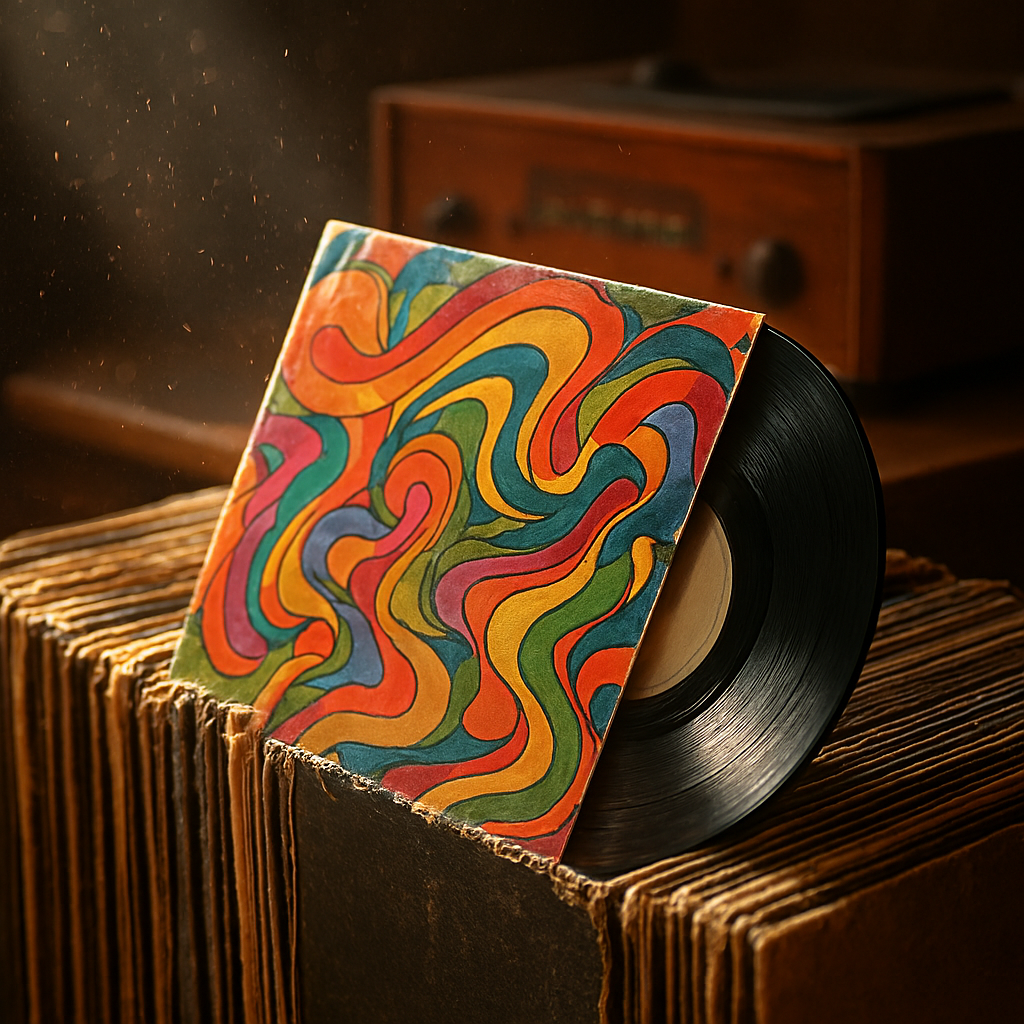
Art on the Cover: The Visual Legacy of Vinyl Records
🇹🇷 Kadifeden Sese: Plak Kapaklarındaki Sanat
🇵🇹 Arte na Capa: O Legado Visual dos Discos de Vinil
04/03/2026
🇬🇧
🇹🇷 Türkçe | Kadifeden Sese: Plak Kapaklarındaki Sanat
Plak dönemi, müziğin yalnızca duyulan bir deneyim olmadığı; aynı zamanda dokunulan, koklanan ve görülen bir sanat formu olduğu yıllardı. Bir plağı raftan alıp iki elinle tutmak, kapağını yavaşça incelemek ve kartonun kendine has kokusunu içine çekmek, dinleme ritüelinin ayrılmaz bir parçasıydı. İğne plağa değmeden önce yaşanan bu an, müzikle kurulan bağın ilk adımıydı. Kapak, daha ilk bakışta dinleyiciyi albümün dünyasına davet eder; ses henüz başlamadan hikâye anlatmaya koyulurdu.
Plak kapaklarının “31 santimetrelik tuvaller” olarak anılmasının nedeni tam da buydu. Sanatçılar ve tasarımcılar için bu büyük yüzey, sınırsız bir ifade alanı sunardı. İllüstrasyonlar, deneysel fotoğraflar ve cesur tipografiler, albümün ruhunu görsel dile çevirirdi. Örneğin The Beatles’ın albüm kapakları, döneminin estetik anlayışını yansıtan kült objelere dönüştü. Kapak tasarımı, müziğin bir uzantısı hâline gelerek dinleyiciyle albüm arasında duygusal bir köprü kurdu.
Müzik türleri değiştikçe kapakların dili de değişirdi. Caz albümlerinde sade ama zarif kompozisyonlar, sofistike bir gece atmosferini çağrıştırırken; rock müzikte çarpıcı renkler, asi fotoğraflar ve sınır tanımayan grafikler öne çıkardı. Pink Floyd gibi grupların kapakları, müziğin kavramsal derinliğini görselleştirerek plakları adeta birer sanat eserine dönüştürdü. Kapağın açılmasıyla içinden çıkan posterler, şarkı sözü kâğıtları ve tasarlanmış iç zarflar, koleksiyon değerini artıran detaylardı.
Plak dinlemek, yalnızca bir şarkıyı arka planda çalmak değildi; başlı başına bir törendi. Albüm kapağını incelemek, şarkı sözlerini okurken görsellerle bağ kurmak ve plağı özenle yerine koymak, dinleyiciyi sürecin aktif bir parçası yapardı. Bugün dijital platformlarda küçücük ekranlara sıkışan albüm görselleri, bu fiziksel deneyimin yerini tutamıyor. Çünkü plak kapakları, müziği yalnızca işittirmez; onu yaşatır, hatırlatır ve saklanabilir bir anıya dönüştürürdü.
🇬🇧 English | Art on the Cover: The Visual Legacy of Vinyl Records
The vinyl era was a time when music was not only something to be heard, but also something to be touched, smelled, and seen. Taking a record from the shelf, holding it with both hands, carefully examining the cover, and breathing in the distinct scent of cardboard were all essential parts of the listening ritual. Before the needle ever touched the groove, the listener was already immersed in the experience. Album covers invited audiences into a visual world, telling a story even before the first note played.
This is why record covers were often called “31-centimeter canvases.” For artists and designers, this generous surface offered limitless creative freedom. Illustrations, surreal photographs, and bold typography translated the spirit of the music into visual language. Albums by The Beatles, for instance, became cultural icons whose covers reflected the aesthetic sensibilities of their time. The cover design acted as an extension of the music, forming an emotional bridge between the artist and the listener.
As musical genres evolved, so did the visual language of album covers. Jazz records often featured refined, minimalist designs that evoked elegance and intimacy, while rock albums embraced striking colors, rebellious imagery, and experimental graphics. Bands like Pink Floyd used cover art to visualize complex concepts, turning vinyl records into collectible works of art. Opening the sleeve to find posters, lyric sheets, and carefully designed inner covers added layers of meaning and increased their value for collectors.
Listening to vinyl was never a passive act. It was a ceremony: studying the artwork, reading lyrics while the music played, and carefully returning the record to its sleeve afterward. Today, digital platforms compress album art into tiny icons on a screen, stripping away much of this sensory richness. What is lost is not just size, but presence. Vinyl covers made music tangible, memorable, and worthy of being preserved as a physical artifact that continues to resonate across generations.
🇵🇹 Português (Brasil) | Arte na Capa: O Legado Visual dos Discos de Vinil
A era do vinil representou um período em que a música não era apenas ouvida, mas também tocada, observada e até sentida pelo cheiro. Retirar um disco da estante, segurá-lo com cuidado, examinar sua capa e perceber o aroma característico do papelão faziam parte do ritual de escuta. Antes mesmo da agulha tocar o disco, o ouvinte já estava envolvido pela experiência. As capas convidavam o público para um universo visual, contando histórias antes da primeira nota soar.
Por isso, as capas de vinil passaram a ser chamadas de “telas de 31 centímetros.” Para artistas e designers, esse espaço amplo permitia liberdade criativa total. Ilustrações, fotografias surrealistas e tipografias ousadas traduziam a essência da música em imagens. Os álbuns de The Beatles, por exemplo, tornaram-se ícones culturais, refletindo o espírito estético de sua época. A capa funcionava como uma extensão da música, criando uma conexão emocional profunda com o ouvinte.
À medida que os gêneros musicais mudavam, a linguagem visual das capas também se transformava. No jazz, predominavam composições elegantes e discretas, enquanto no rock surgiam cores intensas, imagens provocativas e gráficos experimentais. Grupos como Pink Floyd utilizaram a arte das capas para expressar conceitos complexos, elevando os discos a verdadeiras obras de arte colecionáveis. Ao abrir a capa, encontrar pôsteres, letras impressas e encartes bem elaborados aumentava ainda mais o valor simbólico do álbum.
Ouvir um disco de vinil nunca foi uma atividade passiva. Era um ritual completo: observar a arte, acompanhar as letras enquanto a música tocava e guardar o disco com cuidado ao final. Hoje, nas plataformas digitais, as imagens dos álbuns aparecem reduzidas a pequenos ícones, incapazes de substituir essa experiência física. O que se perde não é apenas o tamanho, mas a materialidade. As capas de vinil tornavam a música palpável, memorável e digna de ser preservada como um legado visual e emocional.